论文
A latitudinal gradient of deep-sea invasions for marine fishes
https://www.nature.com/articles/s41467-023-36501-4
s41467-023-36501-4.pdf
论文中对应的图实现的代码都有,链接是
https://github.com/stfriedman/Depth-transitions-paper
里面有个弦图很好看,在论文中对应的是figure3, 对应画图代码是上面链接中的figure2
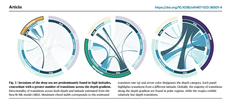
image.png
论文中的作图数据是没有提供的,这里我就随便构造一个数据,能够把论文中提供的代码运行通就可以
示例数据集
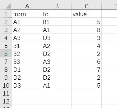
image.png
读取数据集
library(readxl) dat<-read_excel("data/20230301/20230301.xlsx") dat 作图代码
circos.clear() circos.par(start.degree = 90, #gap.degree = 4, points.overflow.warning = FALSE, gap.after=c("A1"=5,"A2"=5,"A3"=15, "B1"=5,"B2"=5,"B3"=15, "D1"=5,"D2"=5,"D3"=15)) grid.col<-c("A1"="#B0E0E6","A2"="#2C8EB5","A3"="#16465B", "B1"="#B0E0E6","B2"="#2C8EB5","B3"="#16465B", "D1"="#B0E0E6","D2"="#2C8EB5","D3"="#16465B") group<-c("A1"="A","A2"="A","A3"="A", "B1"="B","B2"="B","B3"="B", "D1"="D","D2"="D","D3"="D") chordDiagram(dat, grid.col = grid.col, col = rand_color(nrow(dat)), group = group, transparency = 0.25, directional = 1, direction.type = c("arrows", "diffHeight"), diffHeight = -0.04, annotationTrack = "grid", annotationTrackHeight = c(0.08, 0.1), link.arr.type = "big.arrow", # link.sort = TRUE, # link.decreasing = TRUE, link.largest.ontop = TRUE, preAllocateTracks = list( track.height = 0.1, track.margin = c(0.01, 0) )) circos.trackPlotRegion( track.index = 2, bg.border = NA, panel.fun = function(x, y) { xlim = get.cell.meta.data("xlim") #sector.index = get.cell.meta.data("sector.index") sector.index = gsub("[a-z]+_", "", get.cell.meta.data("sector.index")) # Add names to the sector. circos.text( x = mean(xlim), y = 0.5, col = "white", labels = sector.index, facing = "bending", cex = 1, niceFacing = TRUE ) } ) names(group[7:9]) i<-1 highlight.sector(names(group[7:9]), track.index = 1, facing = "bending", font = 2, col = ifelse(i == 1, "#E6AE48FF", "#E6AE483a"), border = ifelse(i == 1, TRUE, FALSE), lwd = ifelse(i == 1, 2, 0.01), text = "tropical", cex = 1.5, text.col = "white", niceFacing = TRUE) highlight.sector(names(group[4:6]), track.index = 1, facing = "bending", font = 2, border = ifelse(i == 2, TRUE, FALSE), lwd = ifelse(i == 2, 2, 0.01), col = ifelse(i == 2, "#20A486", "#20A4863a"), text = "temperate", cex = 1.5, text.col = "white", niceFacing = TRUE) highlight.sector(names(group[1:3]), track.index = 1, facing = "bending", font = 2, col = ifelse(i == 3, "#472D7B", "#472D7B3a"), border = ifelse(i == 3, TRUE, FALSE), lwd = ifelse(i == 3, 2, 0.01), text = "polar", cex = 1.5, text.col = "white", niceFacing = TRUE) } 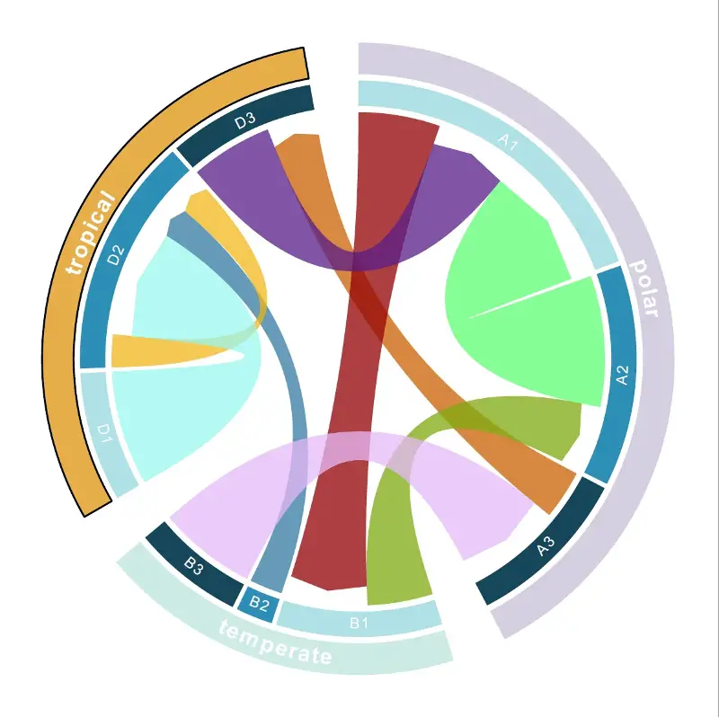
image.png
代码里有很多参数,这里有的我也不太清楚是用来做什么的,先记录实现代码,后续如果有需求做这个图,再来研究具体参数的意思
https://jokergoo.github.io/circlize_book/book/the-chorddiagram-function.html 做这个图可以参考这个链接
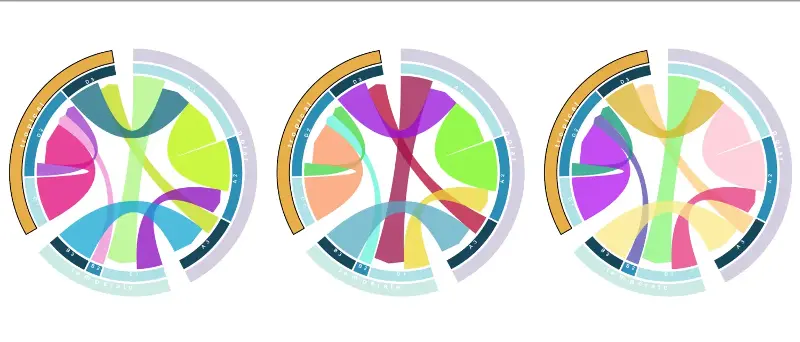
image.png
示例数据和代码可以给推文点赞,然后点击在看,最后留言获取
欢迎大家关注我的公众号
小明的数据分析笔记本
小明的数据分析笔记本 公众号 主要分享:1、R语言和python做数据分析和数据可视化的简单小例子;2、园艺植物相关转录组学、基因组学、群体遗传学文献阅读笔记;3、生物信息学入门学习资料及自己的学习笔记!
微信公众号好像又有改动,如果没有将这个公众号设为星标的话,会经常错过公众号的推文,个人建议将 小明的数据分析笔记本 公众号添加星标,添加方法是
点开公众号的页面,右上角有三个点

image.png
点击三个点,会跳出界面

image.png