今天来主要介绍如何在不引入外部几何对象的前提下在图形的原有的基础上自定义修改轴文本颜色,也许恰好您正好有此特殊需求,希望对各位观众老爷有所帮助;下面来看具体案例;
加载R包
library(tidyverse) 数据清洗
data1 <- mtcars %>% head(6) %>% mutate_if(is.numeric, function(x) x+10) %>% log10() %>% as.data.frame() %>% rownames_to_column("type") %>% pivot_longer(-type) %>% mutate(type=factor(type)) %>% arrange(type) 定义标记角度
empty_bar <- 0 data1$id <- seq(1,nrow(data1)) label_data <- data1 number_of_bar <- nrow(label_data) angle <- 90 - 360 * (label_data$id-0.5) /number_of_bar label_data$hjust<-ifelse( angle < -90, 1, 0) label_data$angle<-ifelse(angle < -90, angle+180, angle) 定义颜色
colors <-c("#FED439FF","#709AE1FF", "#D5E4A2FF","#197EC0FF","#F05C3BFF","#46732EFF", "#71D0F5FF","#370335FF","#075149FF","#C80813FF","#91331FFF", "#1A9993FF","#FD8CC1FF") 数据可视化
ggplot(data1,aes(id,value+5,fill=type))+ geom_bar(stat="identity",alpha=0.8)+ scale_fill_manual(values = colors)+ labs(x=NULL,y=NULL)+ ylim(-7,14)+ coord_polar(start =0)+ theme_void()+ theme( legend.text = element_text(color="black"), legend.title=element_blank(), legend.spacing.x=unit(0.2,'cm'), legend.key=element_blank(), legend.key.width=unit(0.3,'cm'), legend.key.height=unit(0.3,'cm'), legend.position=c(0.5,0.5))+ # 添加标签 geom_text(data=label_data,aes(x=id, y=value+5.5,label=type,hjust=hjust,color=name), fontface="plain",size=2.5,show.legend = F, angle= label_data$angle,inherit.aes = FALSE)+ scale_color_manual(values = colors)+ # 添加外圈 geom_segment(aes(x=0, y=14,xend=66.5,yend =14),size=1.5,color="#3B9AB2", arrow = arrow(length = unit(0, "npc"),type="closed"))+ # 添加内圈 geom_segment(aes(x=0, y=-2,xend=66.5,yend =-2),size=0.5,color="#3B9AB2", arrow = arrow(length = unit(0, "npc"),type="closed"))+ geom_segment(aes(x=0, y=-0.1,xend=66.5,yend =-0.1),size=0.5,color="grey", arrow = arrow(length = unit(0, "npc"),type="closed")) 
可以看到此处我们使用的geom_text在图形内部添加文本并定义颜色,那如果我们要在图形外部修改轴文本颜色该如何操作,当然有更加简单的方法请往下看
构建数据
df <- data1 %>% arrange(id) %>% mutate(id=as.character(id)) %>% head(30) df$id <- factor(df$id,levels = df$id) 基础绘图
p <- df %>% ggplot(.,aes(id,value+5,fill=type))+ geom_bar(stat="identity",alpha=0.8)+ scale_fill_manual(values =c("#EDB749","#3CB2EC","#9C8D58"))+ scale_y_continuous(expand = expansion(0))+ coord_flip()+ theme_test()+ labs(x=NULL,y=NULL)+ theme( axis.text.y=element_text(size=12), legend.text = element_text(color="black"), legend.title=element_blank(), legend.spacing.x=unit(0.2,'cm'), legend.key=element_blank(), legend.key.width=unit(0.3,'cm'), legend.key.height=unit(0.3,'cm'), legend.position="top") 
一个基础的条形图而已,下面我们就在此基础上修改Y轴文本颜色
统一个数
x_cols <- rep(c("#EDB749","#3CB2EC","#9C8D58","#4A452A"),each=11) p + theme(axis.text.y = element_text(colour=x_cols)) 可以看到每一组只对应一种颜色,如果我们想自定义任意文本颜色那,继续往下看
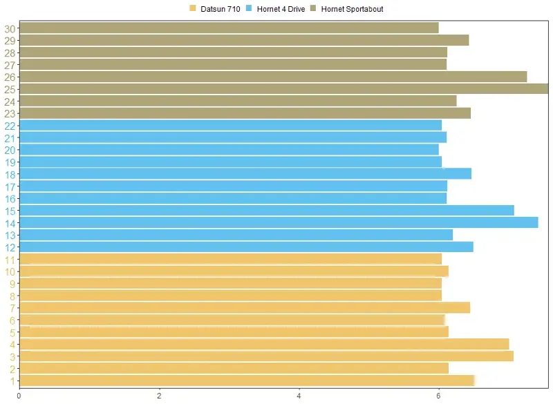
自定义个数
x_cols <- rep(c("#EDB749","#4A452A","#3CB2EC","#9C8D58"),time=c(6,5,11,8)) p + theme(axis.text.y = element_text(colour=x_cols)) 可以看到引入time参数控制每一个颜色出现的次数

当然上述操作ggplot2会显示如下警告信息,是不是发现了什么;感觉挺有趣的
Warning message:
Vectorized input toelement_text()is not officially supported.
Results may be unexpected or may change in future versions of ggplot2.
本节介绍到此结束,更多精彩内容请关注我的公众号R语言数据分析指南